Designers reveal the secrets of skateboard design
Skateboarding is having a moment. Tokyo 2020 is the first time the sport – popularised by Californian surfers as a way to pass the time when waves were low – is being included at the Olympics.
Lockdown has also seen a rise in popularity for skating, suited as it is to social-distancing. MySkate, an app that allows riders to find skateparks in the UK, saw an increase of 180,000 users each month last year.
It’s a fitting time for British skateboarding company Clown to make its return. Founded in 2000 by Jeff Boardman and Vikas Malik, the group brought together leading skateboarders (headed up by Simon Skipp) and added distinctive visuals into the mix. Design was embedded in the company’s DNA from the start, Boardman explains. Banksy, a friend of Boardman, crafted Clown’s logo as well as its first collection of boards.

The collaboration started with a drunken night out with the street artist. Boardman helped Banksy put on his first show at London’s Rivington Street and Banksy provided a work-in-progress for Clown’s logo. “Skating at that point was quite serious,” Boardman says. “We wanted something that was tongue-in-cheek, a bit dark and didn’t take itself seriously.” The gun-toting clown logo, inspired by the 1995 crime drama Dead Presidents, set the tone for the company.
In the 15-year “power nap” between Clown’s closure and revival, Banksy has become a household name. In the skating community, Clown has also established its own legacy. And while the landscape has changed – sneaker culture has driven up board resell prices for collectors, according to Boardman – design is still crucial to Clown’s mission.
“We’re not a one-trick pony”

The boards are generally split into two categories; higher-priced art collaborations and more affordable boards to ride. Clown is also releasing a pro series for the company’s skaters. High-profile collaborators include fine artist Adam Neate and Brian Anderson, the first openly gay professional skateboarder.
The more casual boards have been a chance for the Clown team to revisit its design legacy. Take the Oujia board, an exact replica of a design produced in Clown’s early days. The black-and-yellow board came about after another on-brand “messy affair” during a team trip to Paris. The Clown team was staying at a hotel rumoured to be haunted so decided to throw a séance – and Skipp scribbled up the designs for the Ouija board. “I’m happy to say we didn’t contact anybody,” Boardman says.

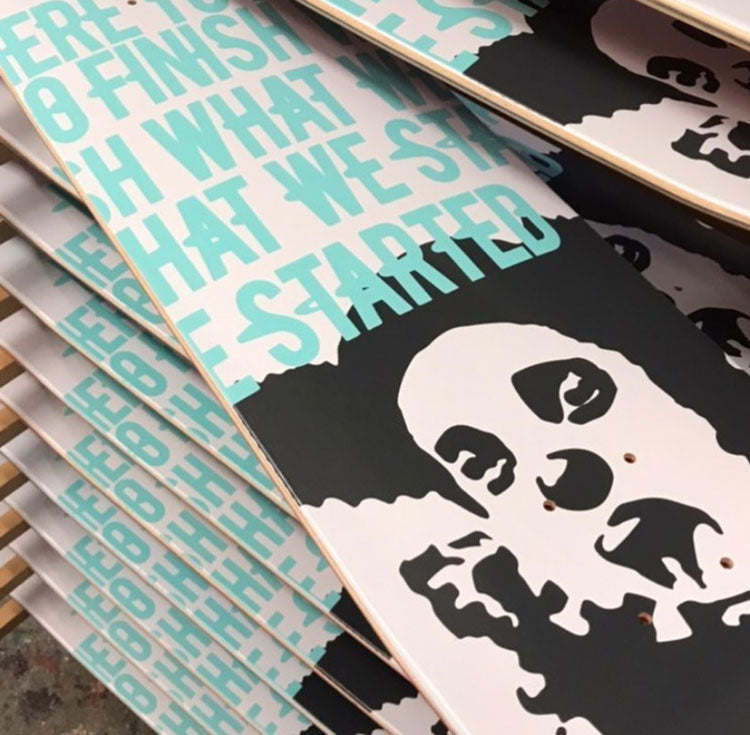
New designs have been worked on between Boardman and Clown creative director Sunil Pawar. Pawar was keen to progress Clown’s font and avoid anything off-the-shelf, explains Boardman. His bespoke typeface, named Bullet Boy, echoes the original logotype (Boardman’s creation) and is set to be released as a free font next year. It’s also been used on the Manifesto series which bears Clown’s updated tagline: ‘Here to finish what we started’.
Recently the clown’s ears have provided the inspiration for Clown’s first-ever pattern, which has been crafted for the company 21st birthday collection, 21 Gun Salute. Pawar has used the logo to develop a camouflage-like pattern, available in three colourways that will form the basis of future work. It’s also a conscious effort to reimagine Clown’s roots. “I love our logo – thank you very much Banksy – but we’re not a one-trick pony,” he adds.
“I never saw a black girl on a skateboard until I did it”

When it comes to celebrity tie-ins, they don’t come much bigger than Beyoncé. Last year, the singer revealed Black Parade, a directory of black-owned businesses. Among them was Ohio-based skate brand Proper Gnar, founded by Latosha Stone. Stone believes she is the first black woman to start a skate company – a rarity reflected in her designs, which seek to capture a different side of skating life.
“I never saw a black girl on a skateboard until I did it,” Stone says about her boards. She was drawn to skate culture after playing the Tony Hawk videogames and began designing for her friends’ metal bands in school. Initially self-taught via YouTube videos, Stone founded Proper Gnar while studying art and design at a community college. After an initial run of apparel, she re-invested funds and was able to move onto her vision of designing skateboards.

The gap in the market was obvious to Stone. “I feel like the skate industry as a whole is aimed at guys and stuff they’re into,” she says. “There wasn’t any feminine stuff or any cute stuff.” Stone’s designs feature a lot of pink shades and heart shapes as a way of appealing to an underrepresented demographic within skating, though she acknowledges these won’t just appeal to women.
A big fan of anime, Stone’s boards often incorporate cartoons with a Proper Gnar twist. Earlier this year, a collection with artist Jasmine Anita Glen was prompted by their joint love of anime. “We redesigned characters as a way to represent all the black girls that were into that stuff,” she says of the Black Girls Anime release. Another youth-focused series with artist Hakim Callwood builds on his character Space Girl, an adventurous young black girl.

Other designs are more personal still. When Stone recently took a DNA test, she discovered that she has Ghanaian ancestry. For Black History Month, Stone applied a pattern to her boards, based on the Kente Cloth, a traditional Ghanaian textile and chose blue and pink to evoke “positive vibes”, she says.
This embodies her vision for Proper Gnar, Stone explains, where design can combine skating and diverse cultures. In America, many African American people find resonance in the Kente cloth, according to the designer. “A lot of us don’t really know what country in Africa we came from, so we cling to that as a traditional African thing,” she says. “It felt cool to be able to bring that to people.”
“You never want to do something that’s already been done”

The need to create something new drives many board designers. “There’s an overarching demand to do something that’s never been done,” says Eric Gorvin, art director at California-based Girl Skateboards and its subsidiary brand Chocolate. Like Stone, Gorvin was a skater first and designed for his friend’s bands (though his major influences were pop-punk groups like Blink-182). After years of being on the road, he joined Girl Skateboards as a graphic designer. It’s here that he was able to bring to life his many ideas for skateboards, Gorvin explains.
He points to three parameters when it comes to design. Graphics have to fit inside the skinny rectangle, feature the logo and also encapsulate “the flavour of the brand”. Girl Skateboards dates back to 1993 and that “soul wrought” spirit has been defined over time, he says. “Any project is better with parameters,” Gorvin adds, and he’s especially interested in how riders will relate to the board as an object.

Gorvin has explored that interest in his design work, where he’s plays with perception. He’s also a fan of perspective-shifting film directors like Wes Anderson and Stanley Kubrick. For example, the Dot series plays on the moiré effect, where interference dot patterns create the illusion of movement. The Don’t Trip series has more modern origins. Gorvin saw a meme on Instagram which instructed people to view the image from the charger portal. From that angle, the words ‘Send nudes’ became visible.
“I’ve never seen anyone do that in skating,” he says, so he applied type treatments to boards that only made sense when viewed at a certain angle. “It was only a matter of time before someone else did it, and I wanted to get it on boards before anyone else,” he explains. Boards in the collection have lines like ‘Don’t even trip’ and ‘Know thyself’. “I love type that presents itself as image,” Gorvin adds. “The brain registers it as shape and then thinks of it as words.”
“Any project is better with parameters”

One of his first board collections comprised scans of crystals he had made years before joining the company. Using the images of amethyst and different rock crystals, he created boards that looked like something out of the geology textbooks – complete with a Helvetica typeface, Gorvin explains. The series was called Geol-OG (the female figure logo that appears on all Girl boards is called the OG).
The collection also highlights how every board needs a concept behind it, according to the designer. “When I look at skate graphics, it almost seems arbitrary a lot of the time,” he says. Gorvin aims to find a concept – whether that’s an artistic technique or something visual – as a starting point. “You start with a spark and make it reveal itself, almost like a painting,” he adds.
